

Tips for Using the Presentation Template
The IT Summit presentation template includes a title slide and five content layouts designed for common presentation needs. Use the examples below to choose the layouts that best support your session.
You may duplicate, rearrange, or remove slides as needed. Keep the provided branding, logos, colors, and footer elements in place so IT Summit presentations remain visually consistent.
Download the presentation template
On this page
Getting started
- Download and open the presentation template.
- Save a working copy using your session title as the file name.
- Update the title slide with your session title, presenter names, and any optional subtitle or supporting information.
- Duplicate the content slides that best fit your presentation.
- Replace the sample text and image areas with your session content.
- Remove any unused demonstration or instructional slides before finalizing your presentation.
Editing text and images
Maintain the provided branding
Keep the IT Summit and University of Arizona logos, header, footer, accent line, background artwork, and theme colors in their original positions.
- Slide titles should generally remain between 28 and 32 points.
- Subtitles should generally remain between 18 and 24 points.
- Body copy should generally remain between 18 and 24 points.
- Table text should generally remain at 16 points or larger.
- Do not stretch, recolor, crop, or replace the official logos.

Official IT Summit title slide.
Title slide
Use the title slide at the beginning of your presentation. It identifies your session, presenters, event location, date, and the IT Summit theme.
Update the following information
- Session presentation title
- Optional session subtitle
- Optional additional information
- Presenter names
Keep the event theme, date, location, background, logos, and footer formatting unchanged.
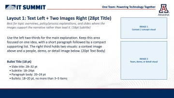
Layout 1: Text with two supporting images.
Layout 1: Text with two supporting images
Use this layout when your explanation is the primary content and the images provide supporting context.
Best used for
- Topic overviews
- Policy or process explanations
- Program or service descriptions
- Project updates
- Examples supported by two related visuals
How to use it
Place the main explanation and a short supporting list in the left portion of the slide. Use the two image areas for screenshots, photographs, examples, or supporting details.
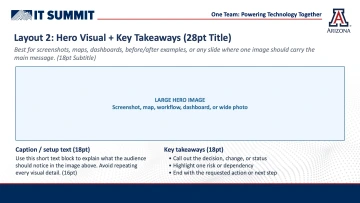
Layout 2: Hero visual with key takeaways.
Layout 2: Hero visual with key takeaways
Use this layout when one large image should carry most of the slide's message.
Best used for
- Website or application screenshots
- Maps and floor plans
- Dashboards or analytics
- Workflows and diagrams
- Before-and-after examples
- Wide event or project photographs
How to use it
Use the large image area for the primary visual. Add a short caption explaining what the audience should notice, followed by the most important takeaways, decision, or next step.
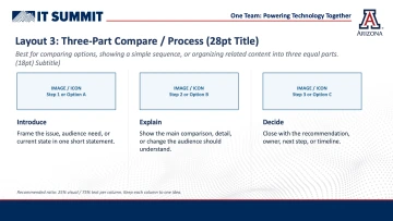
Layout 3: Three-part comparison, sequence, or process.
Layout 3: Three-part comparison or process
Use this layout to organize related information into three equal sections.
Best used for
- A three-step process
- Three available options
- Before, during, and after
- Current state, proposed change, and outcome
- Three priorities or recommendations
- A brief session agenda
How to use it
Give each column one visual cue, one heading, and one short explanation. Keep the content balanced across the three sections and avoid placing long paragraphs in each column.
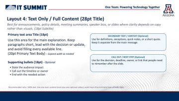
Layout 4: Text-only content with optional callouts.
Layout 4: Text-only content
Use this layout when the message depends primarily on written information rather than images.
Best used for
- Announcements
- Policy details
- Meeting or project summaries
- Speaker biographies
- Definitions or key concepts
- Decisions, deadlines, and next steps
How to use it
Place the main explanation in the primary text area. Use the supporting bullet area only when it helps the audience identify the most important points.
The optional callout areas can be used for definitions, deadlines, owners, resource links, exceptions, short quotations, or requested actions.
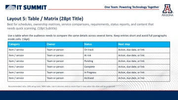
Layout 5: Four-column table or matrix.
Layout 5: Table or matrix
Use this layout when attendees need to compare the same information across multiple items.
Best used for
- Schedules
- Ownership matrices
- Service comparisons
- Project status reports
- Requirements
- Responsibilities and next steps
How to use it
Keep table entries short and use phrases rather than full paragraphs. Clearly label each column in the header row.
Keep the table to approximately five data rows. Divide a large table across multiple slides rather than reducing the font size.
Editing a table
- Select the table to display the Table Design and Layout tabs.
- Use Table Design to adjust fills, borders, and header styling.
- Use Layout to adjust row height, column width, cell margins, and alignment.
- Use Distribute Rows or Distribute Columns to make sizing consistent.
- Keep the existing header color and use a readable font size.
Final presentation checklist
Before submitting or presenting your slides, confirm the following:
Download the presentation template
Save a working copy before adding your session content.